The Usability BoK needs a mechanism to fulfill its remit to be "broad and inclusive in scope, because our profession is inherently multi-disciplinary." It also has to be useful to a range of important user groups who have different needs and experience. A "map" of the subject is what makes content findable and navigable, and also provides a framework from which other efforts (such as certification) can derive their definitions of the profession.
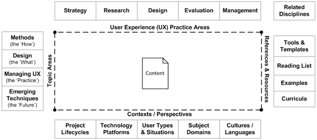
So what might a high-level map look like? For the longer-term vision there are four broad dimensions, illustrated below as four sides of a rectangle. Each of the four dimensions is made up of categories (which are themselves hierarchical, with further categories of detail) that define the commonly understood and useful categories within the dimensions.

Sections of the BoK Map
The main sections of the map are:
-
UX Practice Areas: The core disciplines that align under the umbrella of User Experience, including strategy, user research, design, evaluation, and management. In addition, there are other professional disciplines related to UX, and these relationships also need to be expressed in some way, as described above.
-
Topic Areas: The content 'heart' of the Usability BoK, specific topic can be arranged into methods, design, managing UX, and emerging techniques. That last topic category provides users with information about techniques and ideas that may not yet be part of the mainstream usability practice, but are being researched as ways to solve new challenges.
-
References & Resources: The best way to support people in a way that encourages best practice and long-term professional development is to provide access to tools and information that help people 'get it right.' These references and resources don't have to be housed within the Usability BoK (although some could be), but they should be linked in a way that allows them to be searched, referenced by topics, and available to people who need them. The categorization and mapping between resources and topic areas helps people search for things they know, as well as find pointers to relevant things that they don't know and should explore further.
-
Contexts / Perspectives: This categorization scheme allows people to identify specific situations that relate to their experience and circumstances, and apply them as filters on the available content within the Usability BoK site. The goal is to increase the relevance of the information that people use, while supporting a secondary goal of exposing practitioners to additional information that matches their situation but may not yet be part of their 'toolkit' - thus encouraging professional development.
The categories by themselves are not a 'map' - any more than a list of cities is not a map unless it has the roadways that provide connections between the cities. Over time, it is possible to draw connections between the items in each category, so that the map informs users about the relationships in the overall usability profession's framework, and reflects changes in the profession's scope and relationships.
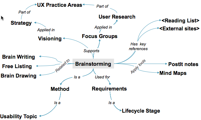
Every item of content, as a topic, is related to the whole map through a series of connections. So a part of the map may look like this:

This framework, modeled as an ontology within a future Usability BoK web site, allows people to hone in on their particular needs based on key criteria that relate to their situations and experience. By including faceted search and browse that maps the touch-points and overlaps with other disciplines, we have the opportunity to incorporate content from outside organizations, as well as share content with those organizations that improves overall visibility.
The connections are more than just links or tags; by naming the relationships between content and terminology, we build a semantic map that can be leveraged in the future as the Semantic Web expands, making the Usability BoK Map increasingly useful over time.
Do We Build the Map from the Top-Down or Bottom-Up?
The Usability BoK team decided some time ago to allow this map to grow organically from the bottom-up, based on the content and the experience of contributors. At the same time, we received and reviewed numerous usability content organizing schemes that already exist in the profession. So in reality we started at both ends and worked toward the middle, drawing from the best of both approaches.
Bottom up creation: One of the best ways to elicit the map was to draw it from the content created by the Usability BoK contributors themselves. Every topic would include references to other topics, terms and descriptions that could turn into keywords. Those reference relationships and terminology would provide the raw materials for the map - much as Card Sort exercises work from collections of terms identified by users and stakeholders, with organization schemes derived as an outcome.
Top down discussions: Early in the project the working group developed a large candidate list of topics that would be relevant to the profession, along with a range of additional metadata lists (such as types of users, stages in software development lifecycles, system platforms, etc.) that would be useful categories for tagging specific items of content as the project moved forward. In 2007 we also gathered a number of categorization scheme examples. While many of these other schemes are created for specific purposes that may be different from the Usability BoK, we 'reality check' our own categorization against these other views of the profession, to try and create as much consistency and alignment as possible.
The initial implementation of this mapping work is what you see in the current site. One reason Drupal was chosen was because of the way it supports taxonomies, which are integrated well into the overall content management.
<


 UXPA
UXPA

